.png)

Brand Identity That Converts
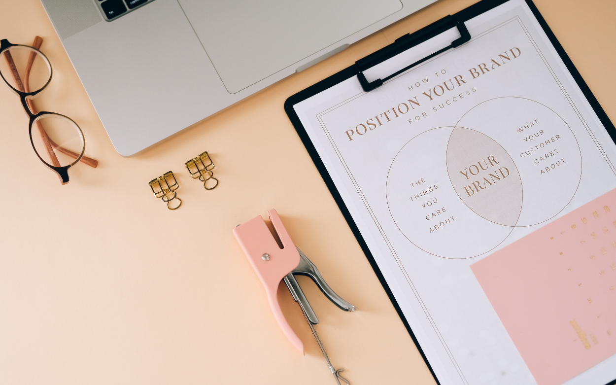
Bold Means Clear Branding
In 2026, bold has very little to do with loud colours or oversized type. It means knowing exactly what your brand stands for and having the confidence to stick with it. A brand that is clear about its identity is far easier to trust and remember. Someone landing on your site for the first time should understand who you are within seconds. That kind of immediate clarity is what bold actually looks like.
Start with Personality
Before touching a colour swatch or font file, it helps to define three to five personality traits that describe the brand as though it were a person. Playful and precise. Calm and authoritative. Warm and direct. Those traits become the filter that every creative decision passes through.
A brand built around precision will naturally reach for tight spacing, cool greys, and clipped copy. A playful one will go somewhere quite different in its visual choices. Getting this down on paper early means the logo, the copywriting, and the social posts all feel like they come from the same place.
Personality is a loyalty driver. A 2025 study looking at brands with strong, recognisable personalities found they consistently generate higher trust and longer-term consumer loyalty. When people can read a brand's character clearly, they feel more connected to it and are more likely to return.Source: 2025 empirical study on brand personality and consumer loyalty
Build a Logo System
A single logo is rarely enough. A brand today lives across a favicon, a social avatar, a pitch deck, a packaging label, and a website header all at once. A proper logo system accounts for all of that. It typically includes a full wordmark for formal uses, a compact icon for small sizes, and a simplified version for contexts where detail gets lost.
The icon can stand alone on a phone screen while the full wordmark carries authority in a document. Each version serves a purpose, and together they keep the brand recognisable at every scale.
Keep the Colour Palette Tight
Strong brand identities tend to work with fewer colours, applied with more intention. A clean neutral base with one or two high-contrast accent colours is usually enough. Think warm white paired with deep charcoal and a single vivid tone.
Fewer colours also make production simpler. The team is not debating shades every time a new asset goes live. A restrained palette, used consistently, starts to feel like a signature rather than a set of arbitrary choices.
Pick Two Typefaces and Commit
One expressive display font for headlines, one highly readable typeface for body copy. The display font carries character and emotion. The body font carries information clearly. Using the same pairing across the website, email, and social graphics means readers stop noticing the fonts and start recognising the brand instead. Consistency here is what makes a brand feel coherent rather than cobbled together.
Visual Language Builds Recognition
Visual language covers everything beyond the logo and colours. The way photography is cropped, the grid used for layouts, whether icons are filled or outlined, how much breathing room surrounds a heading. Individually these feel like minor decisions. Cumulatively they create something distinctive.
When the same cropping style, illustration weight, and grid appear across all touchpoints, people start to recognise the brand before they even read the name. It is worth noting that Stanford credibility research found around three quarters of people judge a company's trustworthiness based on its website design alone. A cohesive visual system is not just an aesthetic choice; it directly affects whether someone decides to trust you.
Design is a trust signal. Stanford Web Credibility Research found that roughly three quarters of users form an opinion about a company's credibility based on its website design. Professional, cohesive layouts make visitors feel the brand is worth engaging with before they have read a single line of copy.Source: Stanford Web Credibility Research
Write Like a Person
Tone of voice often gets treated as an afterthought, which is a shame because it is one of the most immediate ways a brand shows its personality. Gary Tucker, Chief Clinical Officer at D'Amore Mental Health, puts it directly. "People decide whether they trust something before they have consciously processed what it is actually saying. Tone carries emotional signals the brain reads almost instantly, and those signals determine whether someone feels safe engaging further or pulls back entirely."
The relational side of it matters just as much. Kevin Belcastro, LMFT, Clinical Director at San Diego Transformation Center, explains how personality lands with an audience by sharing that "humans extend social expectations onto brands the same way they do with people. When a brand communicates with a clear and consistent personality, it activates the same relational processing we use to decide whether we like and trust someone, and that sense of connection shapes whether a person chooses it."
Taking those core traits and turning them into writing principles makes a real difference. Short sentences. Active verbs. Specific words over vague ones. Michael Anderson, Licensed Professional Counselor at Healing Pines Recovery, describes why the mechanics of language matter as much as the message itself. Anderson's insight is that "the brain is wired to conserve energy. When language is clear and direct, it takes less effort to understand, and that ease of processing registers as competence and clarity. Friction in language creates friction in the decision itself."
The gap between generic copy and personality-driven copy is stark. Compare these two:
Generic 👉 "We leverage innovative solutions to empower your business journey toward sustainable growth."
Personality-driven 👉 "We build tools that help small teams move faster without burning out."
The second one belongs to a specific brand with a clear point of view. The first one could belong to anyone.
Why It All Converts
Personality, logo system, colour, typography, visual language, and tone of voice are not separate projects. They work together to reduce the mental effort a visitor has to spend figuring out who you are. When that effort drops, people are more likely to click, sign up, or buy. Zoe Tambling, LMFT, Clinical Director at Anchored Tides Recovery, expounds that "consistency in how a brand looks and sounds reduces the cognitive work required to recognize and trust it. Familiarity lowers the brain's threat-detection response, and when people feel they already know who they are dealing with, they make decisions faster and with greater confidence."
A strong brand identity gives people enough certainty to act. When the look, the voice, and the feeling are the same everywhere someone encounters you, trust accumulates and decisions become easier to make.
Consistency converts. When colour, typography, and tone stay consistent across website, email, social, and ads, visitors spend less mental energy interpreting the brand and are more likely to take action. Clear rules for logos, fonts, and colour are performance levers as much as they are aesthetic ones. Source: Industry analysis on digital branding and conversion flow, 2025
Related Articles


ZOKKO
Studio
