.png)

Bold Design, Loyal Customers

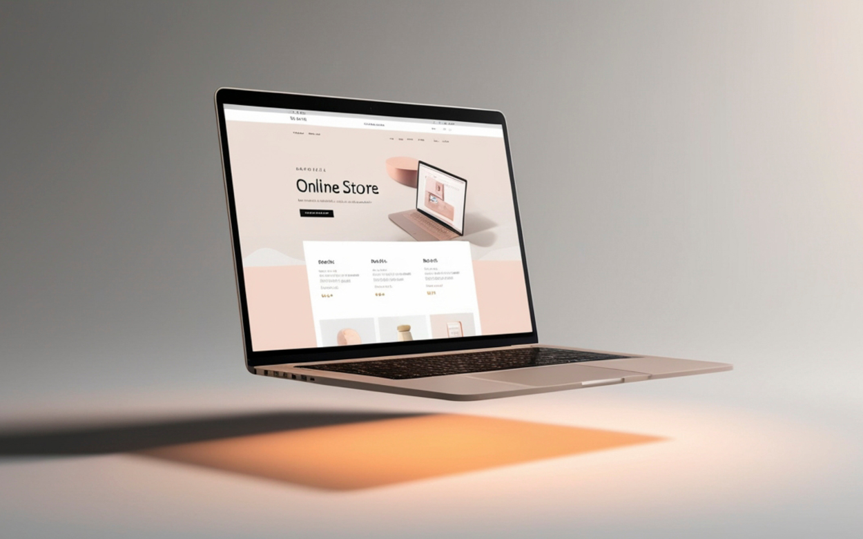
A lot of brands still treat their website like a brochure, a place to list services and wait for someone to notice. A digital flagship works differently, holding the brand, the story and the sales engine together in one space that keeps working long after a visitor lands. Bold design turns that flagship into somewhere visitors want to return to, separating a business people notice from one they forget.
What Makes a Flagship
A digital flagship is simply the main home for a brand online, the version of the business that ties everything else together. It has a look people recognise straight away, a story that comes through without digging, navigation that feels obvious and content that earns its place on the page.
The way a homepage looks says a lot about whether people stick around. Sites built around a cleaner, more modern layout tend to hold attention longer and come across as more trustworthy and easier to use than ones stuck with a dated, cluttered structure. Getting that right carries weight everywhere else too, with social posts feeling more joined up, ads converting better because the landing page matches what was promised, and email subscribers trusting the brand faster because they already recognise its visual language.
Why Sites Stay Static
Sites that never move past brochure status tend to share the same handful of problems. Templates that feel generic blend brands into the background rather than setting them apart. Messaging stays fuzzy, so visitors leave without understanding what the business actually offers. Visuals feel borrowed rather than considered, and without a real path mapped out, people land, scroll for a moment and move on.
None of that helps trust build or memories form. Good design goes beyond making something look nice on a screen. Its actual job is pointing attention toward what matters and nudging visitors toward the next step worth taking.
Bold Design Earns Trust
Bold design comes down to confident visuals, a clear hierarchy, strong typography and colour used with intention rather than scattered everywhere. Visitors take all of that in within seconds of a page loading, often without consciously noticing any of the individual choices.
A visitor decides how much to trust a brand almost immediately, well before reading a single line of copy, and a page that feels ordered and considered earns a warmer response than one that feels rushed or chaotic. There is an emotional side to it too. A site that feels thought through invites people to slow down and explore, rather than heading straight back to a search results page.
Take the same product and present it two different ways. One version crams everything into a tight layout with mismatched fonts and a busy palette. The other gives things room to breathe, sticks to one confident typeface and builds around a single accent colour. The product has not changed, yet the second version reads as premium and worth a closer look.
From Visitor to Loyalist
A digital flagship walks visitors through a journey that feels natural rather than forced. The hero section gives immediate clarity about what the business does and who it serves. From there, a narrative builds around what the brand stands for, giving visitors something to connect with beyond the product itself. Proof follows soon after, drawing on past work, testimonials and results that back up everything said earlier on the page.
- Clarity right at the top
- A story with a clear point of view
- Real proof that supports the story
That sequence nudges visitors toward doing something, whether that means subscribing, following an account or getting in touch. Loyalty rarely comes from one good visit. It builds from repeated experiences that keep matching what the website promised the first time, and that consistency is what turns a visitor into someone who checks back on their own.
Visual consistency plays a bigger part in that than people tend to assume. Keeping the same logo, colours and typography across a site strengthens how people read the brand and builds a stronger emotional connection over time. Those small, repeated cues do more for loyalty than they get credit for, working as a genuine tool for keeping people around rather than just a finishing touch.
Start With an Honest Look
A website has stopped being something that sits quietly in the background. It plays the lead role in how a brand tells its story, day after day. Take an honest look at the current site and think about whether it feels like a genuine flagship or just a placeholder holding a spot online.
A useful starting point is a simple audit covering clarity, visuals and the overall journey a visitor takes. Small, steady improvements from there add up over time into something that finally earns the word flagship.
Related Articles




ZOKKO
Studio

